The Open Repository Explorer and Visualizer (OpenRXV) is a dashboard-like tool that was created to help people find and understand content in open access repositories like DSpace. It began as a proof of concept developed by CodeObia and the Monitoring, Evaluation and Learning (MEL) team at the International Center for Agricultural Research in the Dry Areas (ICARDA) to enable exploring and reporting on content in two key institutional repositories. Later, in partnership with the International Livestock Research Institute (ILRI), the scope was expanded with the idea of supporting more repository types and larger amounts of items. In the future we hope to be able to support any repository that uses Dublin Core metadata and has an API for harvesting.
This project contains a backend indexer powered by Node.js and Elasticsearch, and a dynamic frontend built with Angular, Bootstrap, Highcharts, Angular Material, and Ngrx. The application is wrapped up and deployed via Docker. This product includes GeoLite2 data created by MaxMind, available from https://www.maxmind.com.
You can see an example of the project working on our Agricultural Research e-Seeker (AReS).
- Docker 19.03.0+
- docker-compose 1.21.0+
- dspace-statistics-api (optional, for item views and downloads)
After you have configured Docker you can clone this repository and build OpenRXV:
$ cd docker
$ sudo docker-compose -f docker/docker-compose.yml up -d
Note: the Elasticsearch component requires more virtual memory. You will most likely need to increase the host system's memory map limits by setting vm.max_map_count = 262144 in /etc/sysctl.conf. See the Elasticsearch docs for more information.
Configuration of repositories and metadata to harvest is in backend/config/index.json. Mappings of equivalent metadata values — for example "Kenya" and "KENYA" — are in backend/config/mapping.json.
- Improve documentation (in progress...)
- Add reporting functionality
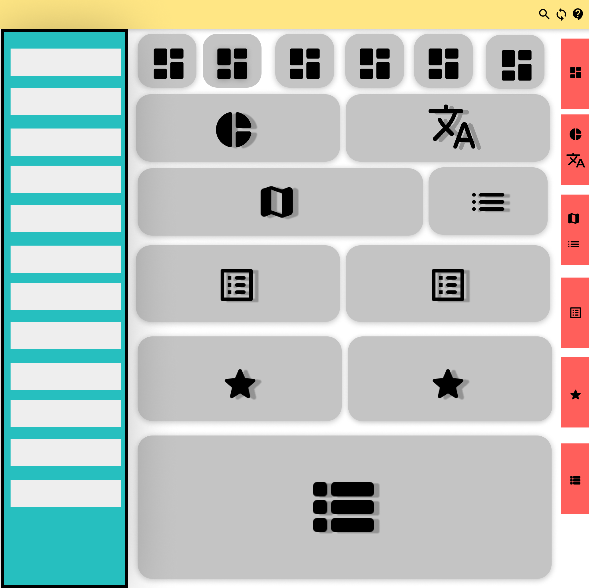
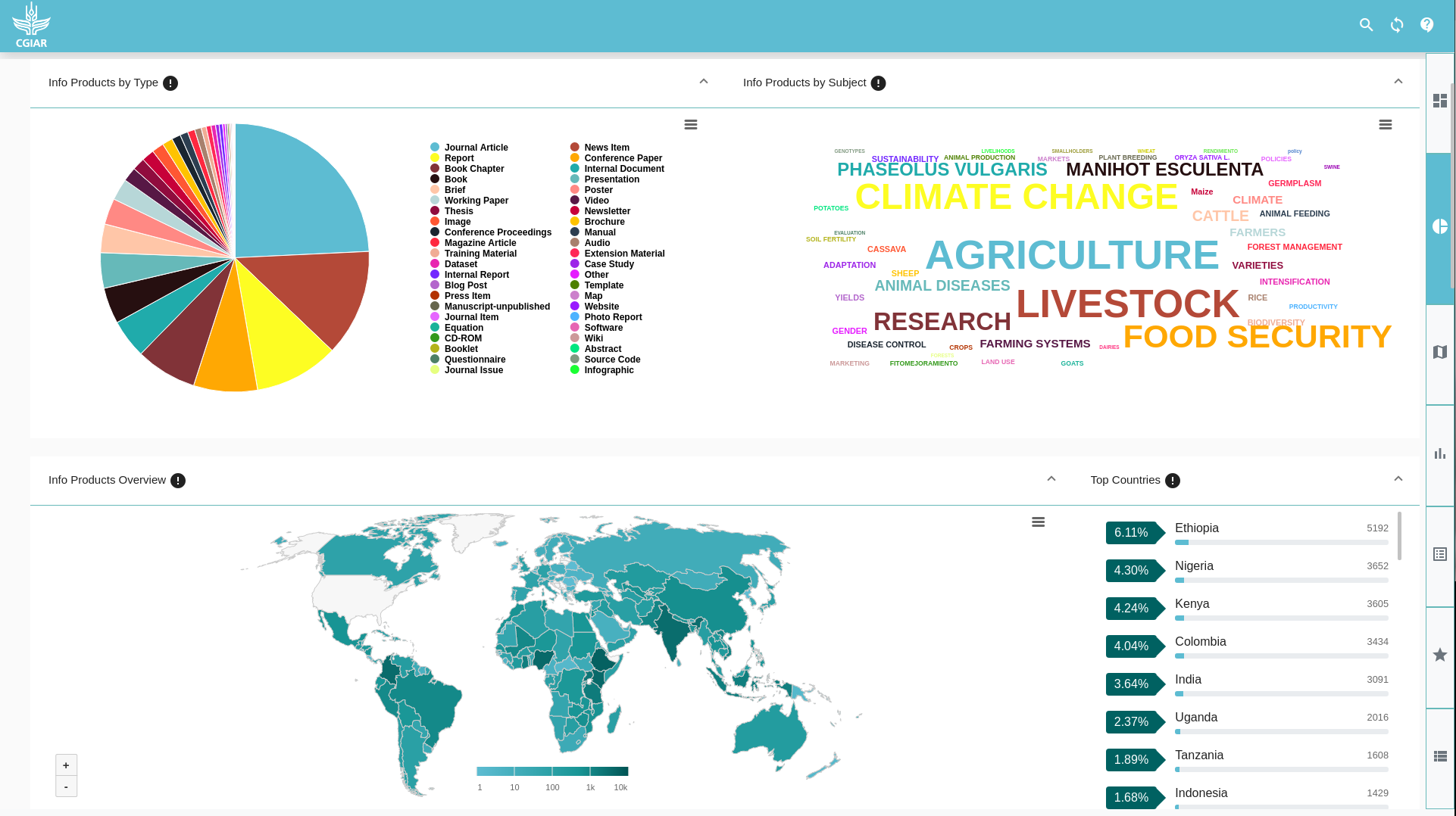
The application is divided into four sections.
- The navbar (yellow): which holds the logo on the left, and three buttons with icons on the right:
 opens the filters sidebar (the fourth section).
 clears the query.
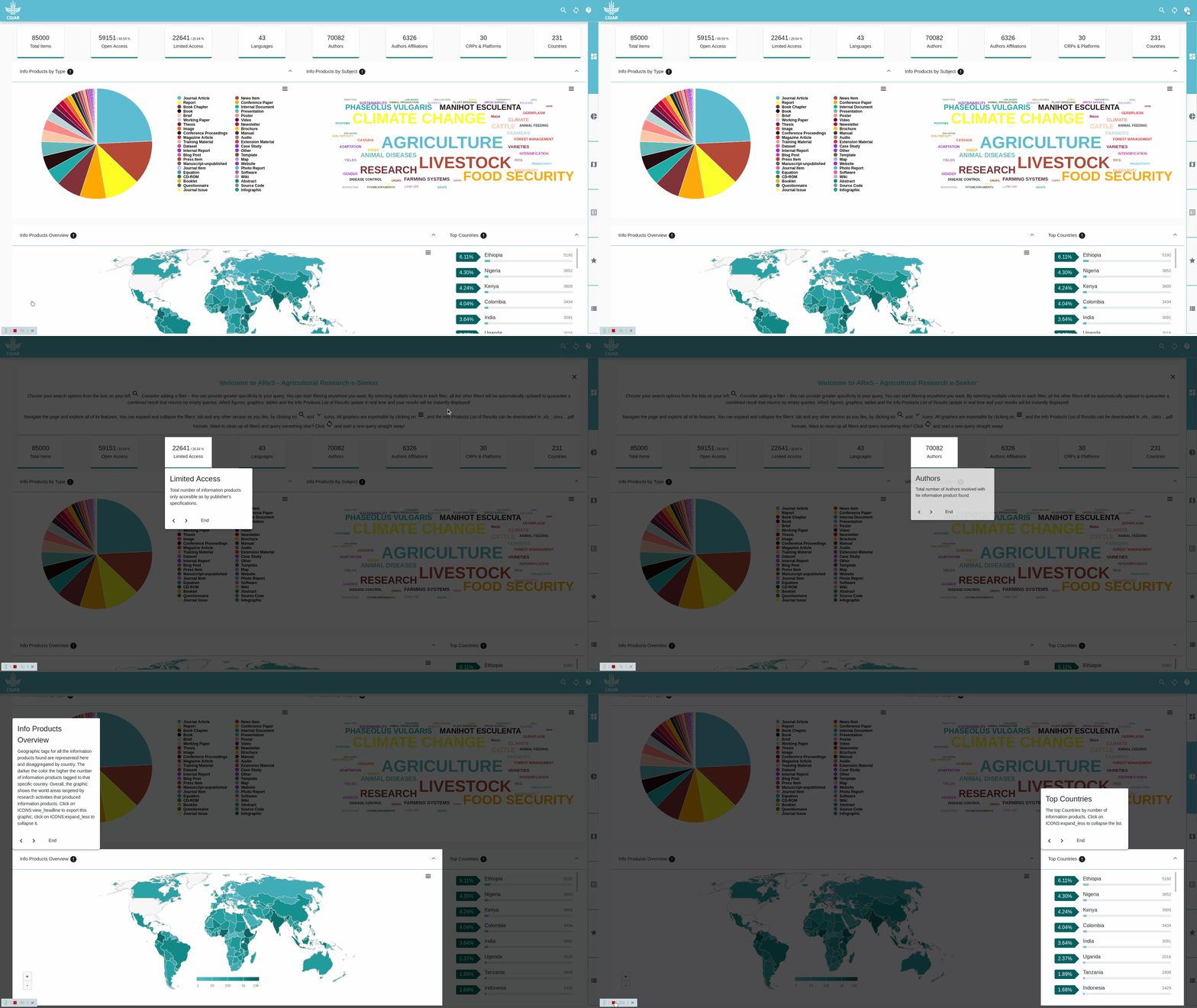
 opens a tutorial (which is a series of popups over the elements in the dashboard).
- The chart and lists components (gray):
- Counters (
 ).
). - Pie (
 ), worldcould (
 ), and map (
 ) charts.
 - Top countries (
 ), top contributors (
 ), Top author affiliations (
 ), CRPs and Platforms (
 ), and funders/investors/sponsors (
 ).
). - Paginated list (
 ).
).
-
The side navigation buttons (red color). These buttons navigate the user to the corresponding components with the same icon(s).
-
The filters (blue color), which are multiple inputs that allow you to search and filter the data. Changes to these filters are immediately reflected in the charts and lists.
Almost everything is configurable: colors, the position of charts, tooltip text, and the data being displayed in the charts themselves. To change these attributes you need to modify some TypeScript and SCSS files, which you can find in /RES/src/configs
-
- Includes the configuration of the upper section that display the ‘number of total items’, ‘number of open access documents’, ‘number of authors’, etc.…
-
- Includes the configuration of the Charts & lists section, here you can add more charts, rearrange, & delete any chart or list.
-
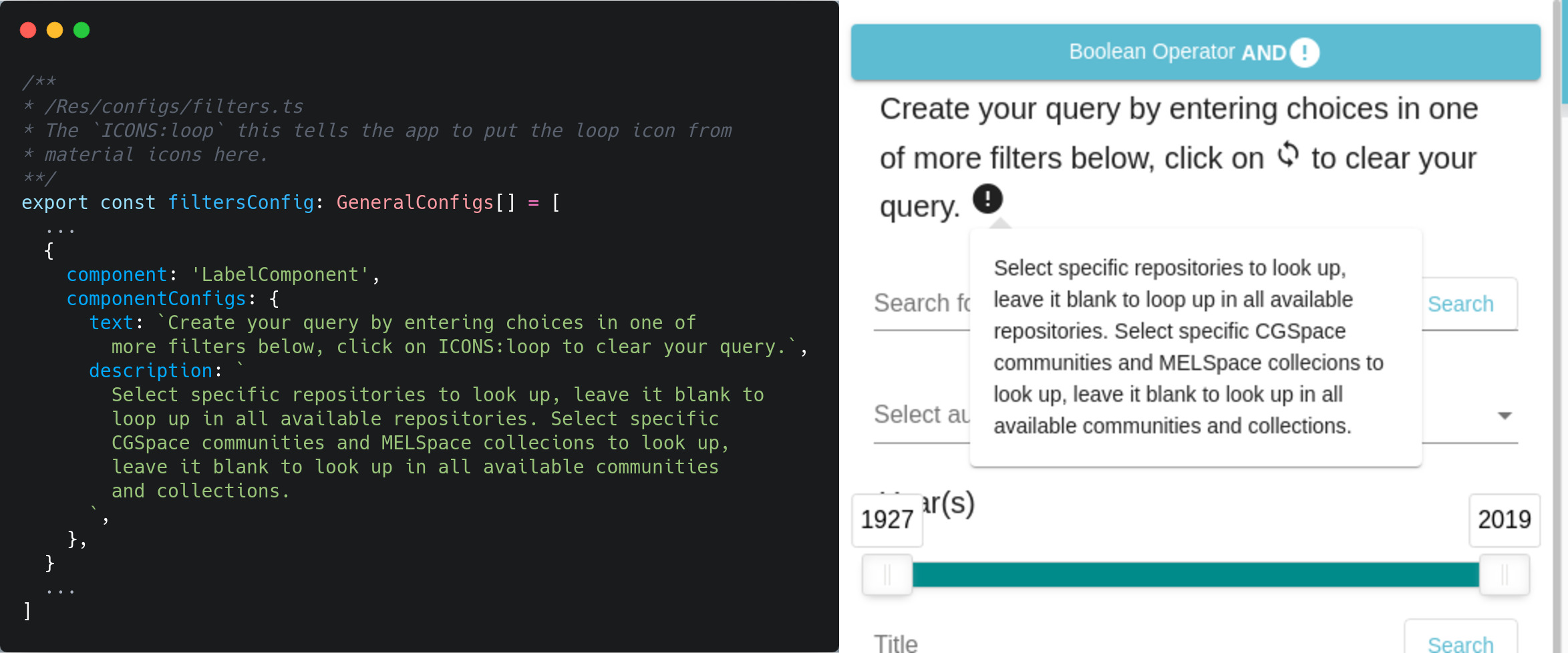
/filters.ts- Includes the configuration of the Side Filters, which you can modify to remove the filter or change the values each filter displays to modify the query.
-
/generalConfig.interface.ts- Just a simple file that holds types that will help your IDE/text editor or you to know the options that you can add in the configurations.
-
/tooltips.ts -
/chartColors.ts-
Holds the colors of the charts in hexidecimal format.
-
Good website to choose nice colors.
-
-
/colorsMap.scss- Includes a sass map that holds the main colors of the whole app.
-
/customTheme.scss- In this file, we make sure that the main color gets applied to all third-party libraries and custom css classes
-
/tour.ts-
Currently, this file only holds the configuration of a single card that will be displayed as the first part of the tutorial, you can modify its text here.
-
The rest of the tutorial will be built from the configuration of
counters.ts&dashboard.ts. -
We will take the title and description from each object and use them in the popover on top of the element:
-
counters.ts,dashbaord.ts, &filter.tsall exports an array of objects ( type hinted via./generalConfig.interface.ts/GeneralConfigs), and each object delegates an element in the web page through a set of properties you might configure.
The properties that you can add to each object :
-
show (optional): which determine if we should hide or show the element that this object delegate, this is useful when you write some code for testing and you do not want to remove it.
-
tour (optional): which if you set it to
true, the app will take thedescription&titlefrom this object and adds them to a popover that shows on top of the element that this object delegates. And if you set it tofalseor didn’t even put it, the element that this object delegate won’t be used the tutorial. -
component (optional in
counter.ts): in the case of the counters you don’t need to add it since each object from this file will delegate a counter component by default, but in thefilters.ts&dashboard.tsyou need to add a string of the name of the component. Available components [SelectComponent,LabelComponent,CounterComponent,SearchComponent,RangeComponent,ListComponent,WelcomeComponent,PieComponent,WordcloudComponent,MapComponent] -
title (optional): The text you will add here will be shown as the header for the counters (this will only affect only the counter).
-
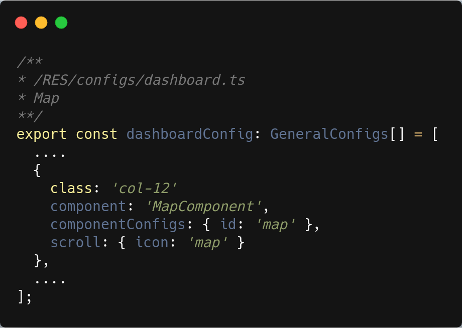
class (optional): bootstrap classes that you want the app to use for the current component. we usually use the grid system classes here to organize each component placement ( bootstrap gird wont effect the counters ), if you added class in the style.scss and add its name here it will work.
-
scroll (optional): this property is responsible for the side navigation buttons (red), and should be added to the
dashboard.ts&counter.tsobjects, and there is a rule you need to keep in mind, in thecounters.tsyou only need to add this property to the first element in the array. -
icon (optional): the icon will be added to the side navigation buttons, all icon names.
-
linkedWith (optional): if the element has another one next to it(like the map & top countries), we need to add the id of that element here, to tell the app that these two are linked.
examples :
-
componentConfigs (required) : this property may be
ComponentDashboardConfigs,ComponentCounterConfigs,ComponentLabelConfigs,ComponentSearchConfigs, orComponentFilterConfigs -
ComponentDashboardConfigs - id (required): any string you want, but this must be unique. - title (required): the title of the popover if this element is used in the tour, also used in the top of the panel that holds the chart . - description (required): the body of the popover, if this element is used in the tour.
-
source (required): string, the elasticsearch key that this component will get its data from, this might be an array of strings in the case of the bar chart.
- In case of the bar chart the source is an array of two strings, which if you put
['author', 'year']the app will produce a bar chart of authors by year and two filters the first one is filter by author and the second is filter by year, as same as their order in the array.
- In case of the bar chart the source is an array of two strings, which if you put
-
content (optional):
PaginatedListConfigsobject which contains the following properties:- TODO ....
-
ComponentCounterConfigs:
-
id (required): any string you want, but this must be unique.
-
title (required): the title of the popover if this element is used in the tour.
-
description (required): the body of the popover, if this element is used in the tour.
-
source (required): string, the elasticsearch key that this component will get its data from, this might be an array of strings in the case of the chart bar.
-
percentageFromTotal (optional) : (boolean) should this counter displays a percentage from the total items.
-
-
filter (optional): (string) the filter for
open accessorlimited access. -
ComponentLabelConfigs (this object is used in the side filters (
filters.ts) and delegates a label that separate each section of a filters):
-
ComponentSearchConfigs (this object is used in the side filters (
filters.ts) and delegates a search text box that is used to search in a specific key in elasticsearch)-
placeholder (required) : the placeholder in the input.
-
type (required) : which is
searchOptionsand could betitleSearchorallSearch. -
ComponentFilterConfigs (delegates a multiple select filter):
-
source (required): string, the elasticsearch key that this filter will get its data from.
-
placeholder (required) : the placeholder in the input.
-
expandPosition (optional) : the position that the select options will expand to might be
toporbottom, if you do not provide a position the app will expand the select based on the user view. -
addInMainQuery (optional) : (boolean), the main query that gets called when you first load the page and when you change any filter values takes the
sourceproperty from the configs and build the main query, but there are somesourcesthat only needed for the filters. So if this was set to true this source will be used in the main query else it won't. this makes the app faster, hence it dose not load data, unless it needs it.
-
Note about the generic configurations:
- If you changed the order of the objects in any of the arrays in
dashboard.ts,counters.ts, &filters.tsthe order of the element that this object delegates will change according to the new order you gave it
If you go to /RES/src/configs/colorsMap.scss you will find a scss map, which contains the pirmary custom colors of the app, and follows the angular material theming convection, the key 500 is the color that we see often on the page.
Change the map with the colors you want (if you commented the original one and uncommented the map under it you will see how the page changes).
Changing this map will not change the colors of the charts, to change them go to /RES/src/configs/chartColors.ts and you will see multiple exported variables.
-
selectMapColors (object)
- hover(string): the color that the app will fill the country that the user hover over it.
-
select(object): when the user clicks on a country
-
color(string): the color of the country after the user clicks on it.
-
borderColor(string): the color of the country borders after the user clicks on it.
-
-
axisColorForMap(object): the color countries in the map chart.
-
minColor, midColor, maxColor
-
legendTextColorForPie(string): the color of the text legends in the pie chart.
-
-
LegendNavigationColors(object): these are the colors for the arrows in the pie chart legends
-
activeColor(string): the color that the arrow will be filled if the user can click on it.
-
inactiveColor(string): the color that the arrow will be filled if the user can't click on it
-
-
style(object):
-
color(string): the color of how many pages of legends we have (this might not show on big screens).
-
chartValuesColors (array of strings): the colors of the charts (excluding the map), starts from the highest value.
-
we included a file /RES/src/configs/codeobia.colors.ts which includes colors that match with the commented scss map, active them both and see how much change happens. ( copy the content of the codeobia.colors.ts into charts.colors.ts after you deleted every thing in it).
-
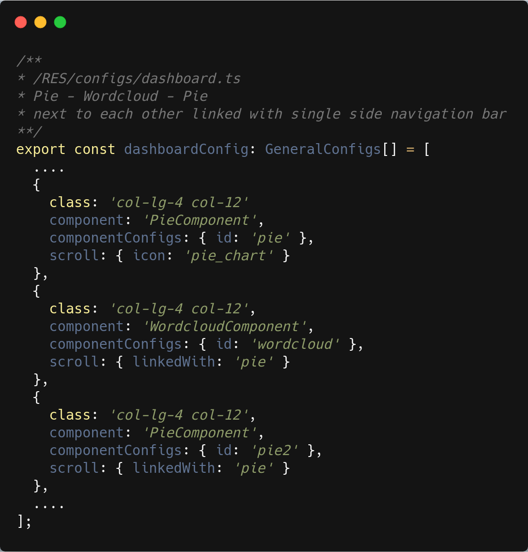
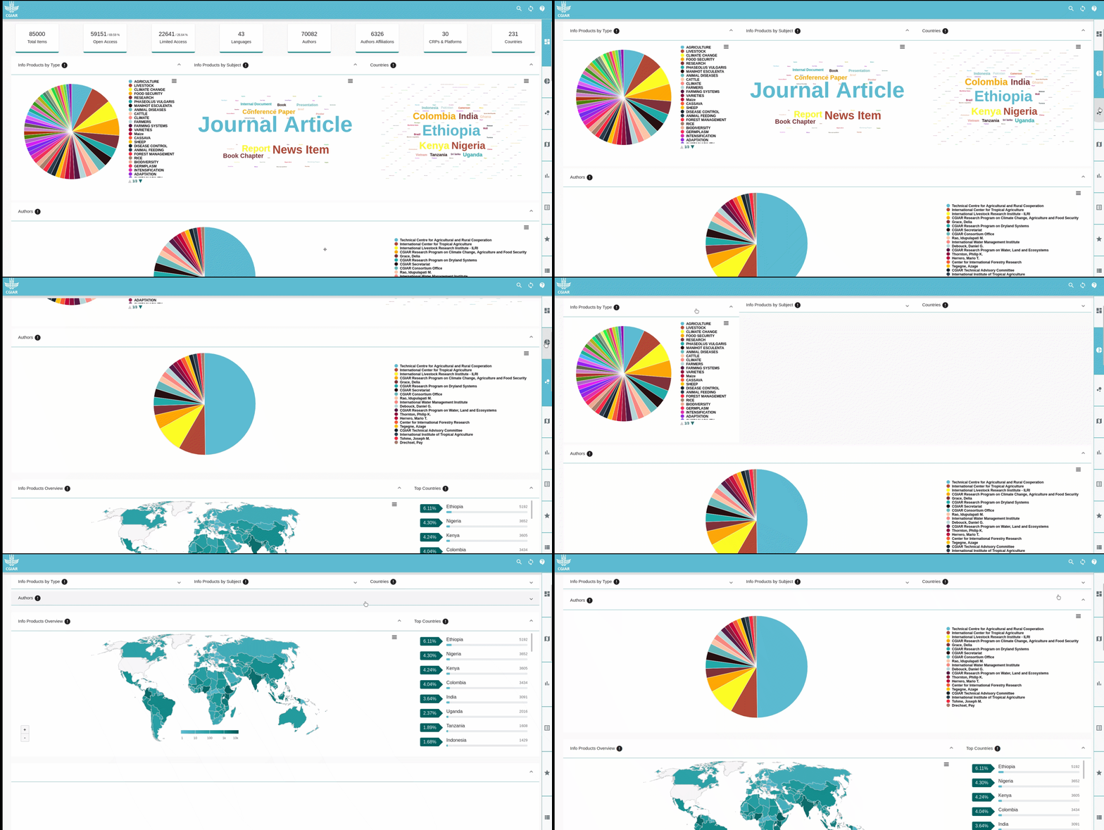
swapping the source of the pie and worldcloud charts, and adding a third chart next to them (source country) and making them all linked with the same side navigation button.
-
adding full width chart with custom icon on the side navigation buttons (with source 'author').
Old `/RES/src/configs/dashoards.ts` ( Click to expand )
export  const  dashboardConfig:  GeneralConfigs[] = [

{

show:  true,

class:  'col-md-6 no-side-padding',

component:  'PieComponent',

componentConfigs:  {

id:  'pie',

title:  'Info Products by Type',

source:  'type',

description:  `....`,

}  as  ComponentDashboardConfigs,

scroll:  {

icon:  'pie_chart',

},

tour:  true,

},

{

class:  'col-md-6 no-side-padding',

show:  true,

component:  'WordcloudComponent',

componentConfigs:  {

id:  'wordcloud',

title:  'Info Products by Subject',

source:  'subject',

description:  `...`,

}  as  ComponentDashboardConfigs,

scroll:  {

linkedWith:  'pie',

},

tour:  true,

},

....

]
New `/RES/src/configs/dashoards.ts` ( Click to expand )
export  const  dashboardConfig:  GeneralConfigs[] = [

{

show:  true,

class:  'col-md-4 no-side-padding',

component:  'PieComponent',

componentConfigs:  {

id:  'pie',

title:  'Info Products by Type',

source:  'subject',

description:  `...`,

}  as  ComponentDashboardConfigs,

scroll:  {

icon:  'pie_chart',

},

tour:  true,

},

{

class:  'col-md-4 no-side-padding',

show:  true,

component:  'WordcloudComponent',

componentConfigs:  {

id:  'wordcloud',

title:  'Info Products by Subject',

source:  'type',

description:  `...`,

}  as  ComponentDashboardConfigs,

scroll:  {

linkedWith:  'pie',

},

tour:  true,

},

{

class:  'col-md-4 no-side-padding',

show:  true,

component:  'WordcloudComponent',

componentConfigs:  {

id:  'pie2',

title:  'Countries',

source:  'country',

description:  ``,

}  as  ComponentDashboardConfigs,

scroll:  {

linkedWith:  'pie',

},

tour:  true,

},

{

class:  'col-12 no-side-padding',

show:  true,

component:  'PieComponent',

componentConfigs:  {

id:  'pie3',

title:  'Authors',

source:  'author',

description:  ``,

}  as  ComponentDashboardConfigs,

scroll:  {

icon:  'bubble_chart',

},

tour:  true,

},

....

]-
To change the order of the components and lists in the website.
-
You can change the order of the objects, and their placement in the app will change accordingly.
-
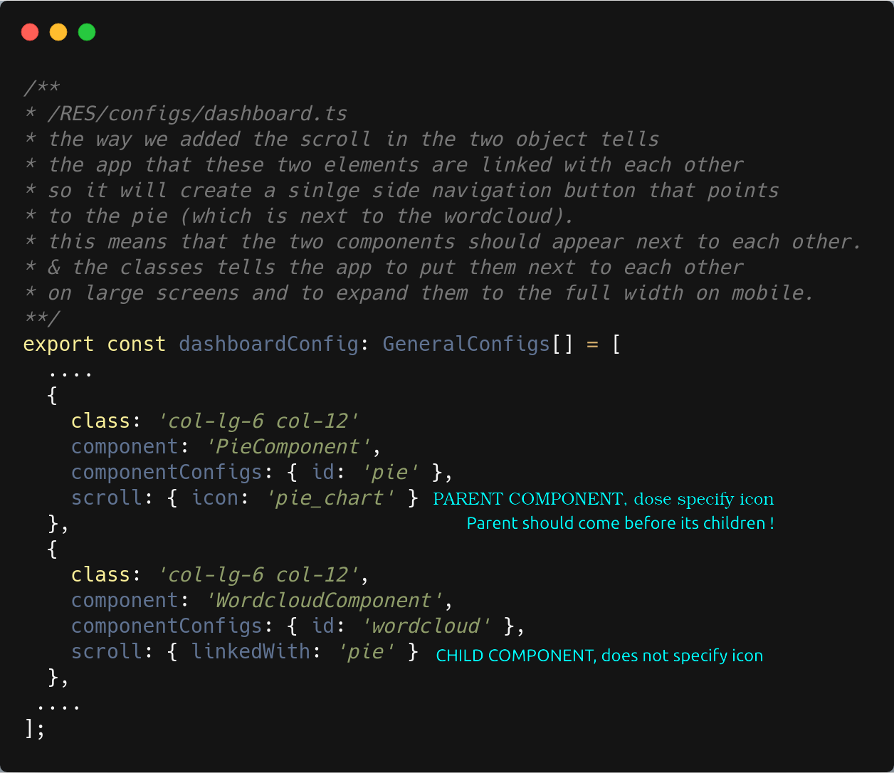
BUT keep in mind the parent object which is the one with
scroll : {icon: 'name'}should appear as the first one to its children in the array. ( the child hasscroll: {linkedWith: 'parent_id'}). - for example in the previous example the pie chart is the parent of the two world cloud components and if you want to change the order of the component you need to keep the pie as the first one ( but of course you can change the parent to a different chart type or even a list ). -
for example in the previous example the pie chart is the parent of the two world cloud components and if you want to change the order of the component you need to keep the pie as the first one ( but of course you can change the parent to a different chart type or even a list ).
-
This work is licensed under the GPLv3. The license allows you to use and modify the work for personal and commercial purposes, but if you distribute the work you must provide users with a means to access the source code for the version you are distributing. Read more about the GPLv3 at TL;DR Legal.
Read more about ILRI's commitment to openness click here.
