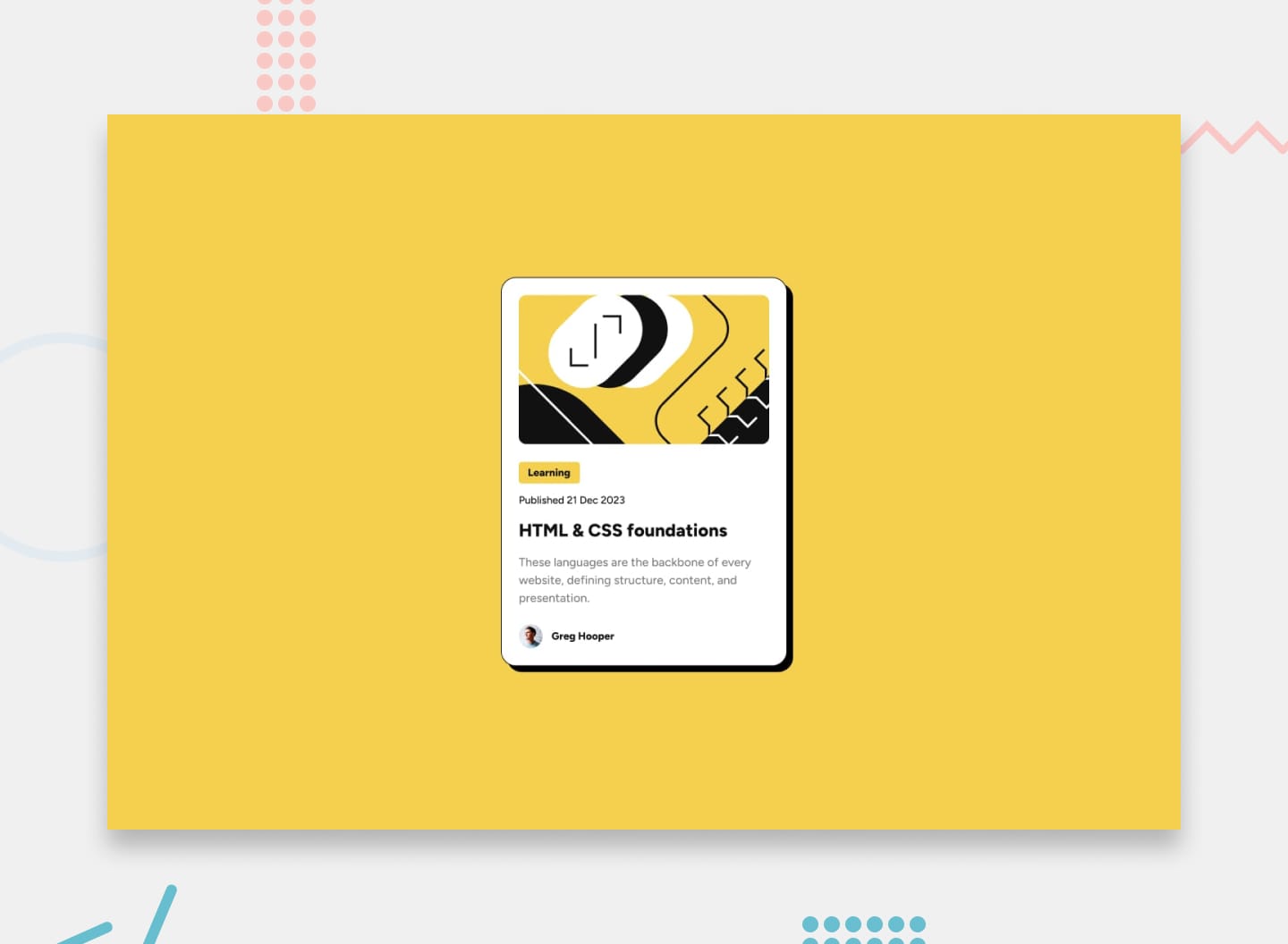
The challenge is to implement this design and make it responsive to different screen sizes.
Desktop Preview
Mobile Preview
-
I used
widthproperty set tofit-contentto avoid the hover effect when hovering next to the text instead of directly over it . -
Like the previous challene, used flexbox to make the layout responsive across different screens.
-
Used flexbox to make the footer image and the name on the same horizontal line and centered.
Check the live site on Github Pages: Blog Card
