-
Notifications
You must be signed in to change notification settings - Fork 140
100_070_Charts_Layout
Previous Chapter Previous Page Next Page Next Chapter Table of content
- angleLineColor
- angleLineStyle
- angleLineWidth
- angleShowLineOut
- barBorderRadius
- barDatasetSpacing
- barShowStroke
- barStrokeWidth
- barValueSpacing
- bezierCurve
- bezierCurveTension
- complementaryBar
- complementaryBarFullHeight
- complementaryColor
- complementaryStrokeColor
- datasetFill
- datasetStrokeStyle
- datasetStrokeWidth
- defaultFillColor
- defaultStrokeColor
- extrapolateMissingData
- forceGraphMax
- forceGraphMin
- graphMax
- graphMaximized
- graphMin
- linkType
- makerShape
- maxBarWidth
- percentageInnerCutout
- pointDot
- pointDotRadius
- pointDotStrokeStyle
- pointDotStrokeWidth
- pointLabelFontColor
- pointLabelFontFamily
- pointLabelFontSize
- pointLabelFontStyle
- radiusScale
- rotateLabels
- segmentShowStroke
- segmentStrokeColor
- segmentStrokeStyle
- segmentStrokeWidth
- startAngle
- showZeroValue
- totalAmplitude
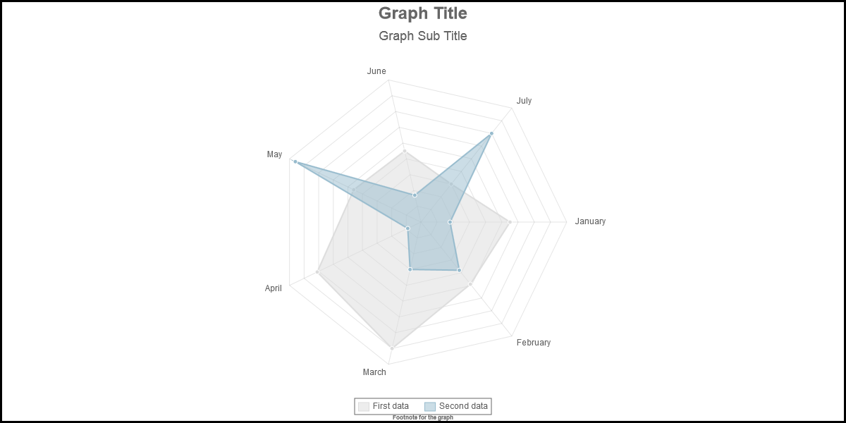
Description : In radar chart, lines are drawn from the center to the external part of the chart; With option angleLineColor you can set the color of the line.
Chart types : radar
Values : any valid color
Default value : "rgba(0,0,0,.1)"
Sample : scaleLineColor : “yellow”
See also : angleLineWidth,scaleLineColor, scaleLineWidth
Description : In radar chart, lines are drawn from the center to the external part of the chart; With option angleLineStyle you can set the style of the line.
Chart types : radar
Values : any predefined value or an array or a function
Default value : "solid"
Sample : angleLineStyle : "dotted"
See also : angleLineColor,angleShowLineOut, scaleLineColor, scaleLineWidth
Description : In radar chart, lines are drawn from the center to the external part of the chart; With option angleLineWidth you can set the width of the line.
Chart types : radar
Values : any positive integer
Default value :1
Sample : angleLineWidth : 3
See also : angleLineColor,angleShowLineOut, scaleLineColor, scaleLineWidth
Description : In radar chart, lines are drawn from the center to the external part of the chart; With option angleShowLineOut you can decide if those lines have to be displayed or not.
Chart types : radar
Values : true or false
Default value : true
Sample : angleShowLineOut : false
See also : angleLineColor,angleLineWidth, scaleLineColor, scaleLineWidth
Description : Bars and horizontalBars ends can be rounded. Therefor use option barBorderRadius.
Chart types : bar, HorizontalBar
Values : any positive integer
Default value : 0
Sample : barBorderRadius:3
See also :
Description : with the barDatasetSpacing, you can define the free space (in pixel) after each bars.
Chart types : bar, horizontalBar, stackedBar, horizontalStackedBar
Values : any positive integer.
Default value : 1
Sample : barDatasetSpacing : 20
See also : barValueSpacing
Description : bars can be rouned or not by lines. Set option barShowStroke to true if you want to drawn those lines.
Chart types : bar, horizontalBar, stackedBar, horizontalStackedBar
Values : true or false
Default value :true
Sample : barShowStroke : false
See also : barStrokeWidth
Description : Specify the width of the lines rounding the bars with option barStrokeWidth
Chart types : bar, horizontalBar, stackedBar, horizontalStackedBar
Values : any positive value.
Default value : 1
Sample : barStrokeWidth : 5
See also : barShowStroke
Description : with option barDatasetSpacing, you can define the free space after each bar; With option barValueSpacing, you can define an additional free space after a group of bar (for stackedBar and horizontalStackedBar each bar is a group of bar…)
Chart types : bar, horizontalBar, stackedBar, horizontalStackedBar
Values : any positive value.
Default value : 5
Sample : barValueSpacing : 10
See also :barDatasetSpacing
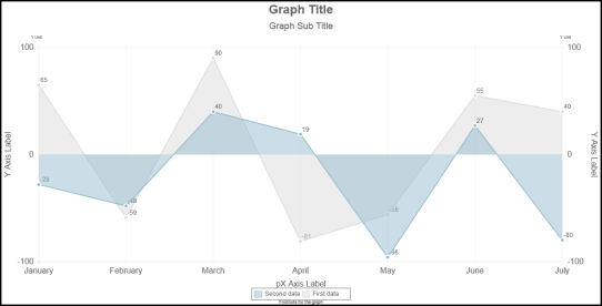
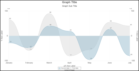
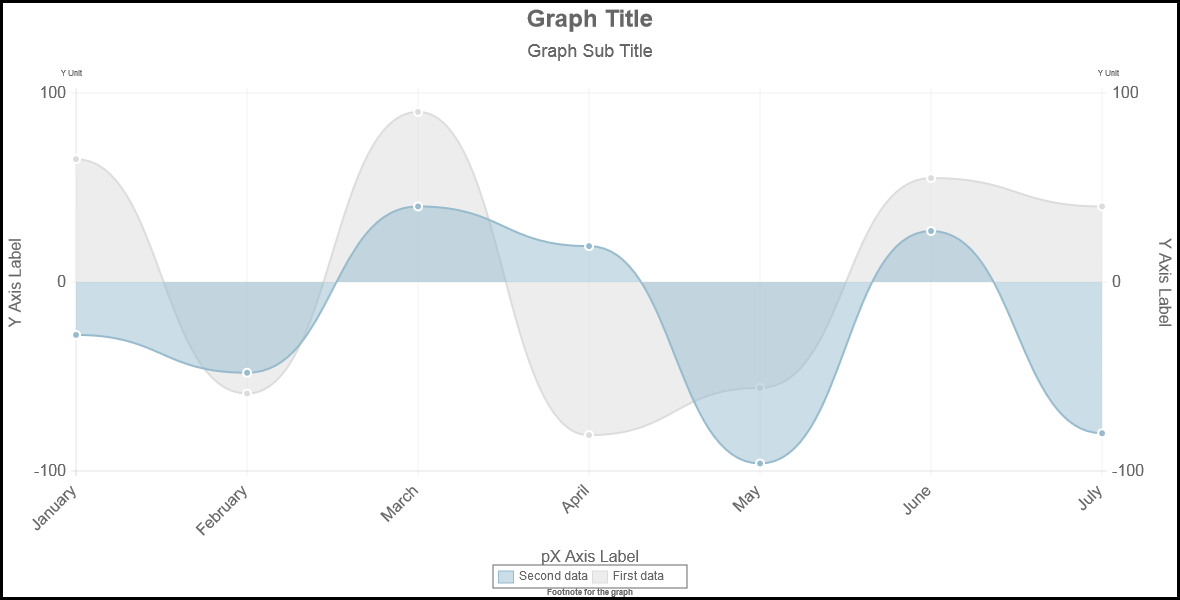
Description : in line chart, you can round the lines between two points or drawn line segments. Use option bezierCurve for defining your choice.
Since version 2, the algorith implemented for the bezierCurve is the one explained by Rob Spencer at http://scaledinnovation.com/analytics/splines/aboutSplines.html.
Chart types : line
Values : true or false or an array or a function
Default value :true ( round the lines)
Sample : bezierCurve : false
See also : bezierCurveTension
Description : in Rob Spencer algorith, there is a "tension" variable; By default, the tension is set to 0.4. Setting the tension to 0 is equivalent to draw straight lines (<=> bezierCurve=false)
Chart types : line
Values : numeric value or an array or a function
Default value : 0.4
Sample : bezierCurveTension : 0.3
See also : bezierCurve
Description : in (Horizontal)Bar chart, you can draw what we define as the complementary bar. The complementary bar is a bar that is drawn over the bars (under the bars for negative values) upto the edge of the chart. By default, the complementary bar is not drawn (complementaryBar : false).
Chart types : Bar, HorizontalBar
Values : true or false
Default value : false (no complementary bar)
Sample : complementaryBar : true
See also : complementaryColor, complementaryStrokeColor
Description : By default, for posive (and null) values, the complementary bar is drawn over the bar and for negative values the bar is drawn under the bar. If you set the option complementaryBarFullHeight the complementary bar will be drawn over and under the bar. This option will have an effect only if there are posive and negative values in the data.
Chart types : Bar, HorizontalBar
Values : true or false
Default value : false (complementary bar not of full height)
Sample : complementaryBarFullHeight : true
See also : complementaryBar, complementaryColor, complementaryStrokeColor
Description : in (Horizontal)Bar chart, you can draw what we define as the complementary bar. The complementary bar is a bar that is drawn over the bars upto the edge of the chart. By default, the complementary bar is not drawn (complementaryBar : false). The fill color of the complementary bar is with option "complementaryColor"
Chart types : Bar, HorizontalBar
Values : any color.
Default value : ""rgba(100,100,100,0.3)""
Sample : complementaryColor : "rgba(10,10,220,0.2)"
See also : complementaryBar, complementaryStrokeColor
Description : in (Horizontal)Bar chart, you can draw what we define as the complementary bar. The complementary bar is a bar that is drawn over the bars upto the edge of the chart. By default, the complementary bar is not drawn (complementaryBar : false). The color of the line around the complementary bar is defined with option "complementaryStrokeColor"
Chart types : Bar, HorizontalBar
Values : any color.
Default value : ""rgba(100,100,100,0.1)""
Sample : complementaryColor : "rgba(10,10,220,0.1)"
See also : complementaryBar, complementaryColor
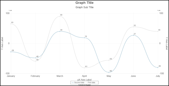
Description : in line chart, the space between the X Axis (on position 0) can be filled or not. In radar chart, the area can be filled or not.
Chart types : line,radar
Values : true or false
Default value : true ( line are filled)
Sample : datasetFill : false
See also :
Description : specify the style of the lines with option datasetStrokeStyle ATTENTION : the option is used ONLY if datasetStrokeStyle is not specified in the dataset himself - see Line datasets.
Chart types : radar, line, bar, stackedBar, horizontalBar, horizontalStackedBar
Default value : "solid"
Sample : datasetStrokeStyle : "dotted"
See also :
Description : specify the width of the lines with option datasetStrokeWidth
Chart types : radar, line
Values : any positive integer
Default value : 2
Sample : datasetStrokeWidth : 10
See also :
Description: for some charts, you have to define the filling color. If you omit to specify a fillColor, thedefaultFillColor will be used.
Chart types : line, Bubbles, bar, horizontalBar, stackeBar, horizontalStackedBar, radar
Values : any valid color
Default value : “rgba(220,220,220,0,5)”
Sample: defaultFillColor : “green”
See also : defaultStrokeColor
Description: for some charts, you have to define the stroke color. If you omit to specify a strokeColor, thedefaultStrokeColor will be used.
Chart types : line, bar, horizontalBar, stackeBar, horizontalStackedBar, radar
Values : any valid color
Default value : “rgba(220,220,220,1)”
Sample: defaultFillColor : “green”
See also : defaultFillColor
Description: When there are missing values in line charts, the not missing points are linked; If you prefer that points between missing values are not linked, set option "extrapolateMissingData : false"
Chart types : line
Values : true or false
Default value : true
Sample: extrapolateMissingData : false
See also : https://github.com/FVANCOP/ChartNew.js/wiki/150_Missing_Values
Description : when option graphMax is specified, the maximum value of the Y axis is set by the value associated to graphMax even if the maximum value to be displayed is greater that this value. Is you set option forceGraphMax to false (default value is true), the maximum value of the axis will at least the value of graphMax but will be greater if the maximum of the value to be displayed is greater than graphMax.
Chart types : line, Bubbles, bar, horizontalBar, stackeBar, horizontalStackedBar, radar, polarArea
Values : true or false
Default value : true
Sample : forceGraphMax : false
See also : graphMax, forceGraphMin
Description : when option graphMin is specified, the minimum value of the Y axis is set by the value associated to graphMin even if the minimum value to be displayed is lower that this value. Is you set option forceGraphMin to false (default value is true), the minimum value of the axis will at most the value of graphMin but will be lower if the minimum of the value to be displayed is lower than graphMin.
Chart types : line, Bubbles, bar, horizontalBar, stackeBar, horizontalStackedBar, radar, polarArea
Values : true or false
Default value : true
Sample : forceGraphMin : false
See also : graphMin, forceGraphMax
Description : by default, the maximum value of the Y Axis is computed on basis of your data. You can forcethe maximum value with option graphMax.
Chart types : line, Bubbles, bar, horizontalBar, stackeBar, horizontalStackedBar, radar, polarArea
Values : any real value or an array or a function
Default value : (none)
Sample : graphMax : 100
See also :graphMin
Description : The chart part in radar charts is not maximized : it most of the case, it can be greater if it is not centered. With option graphMaximized, the chart is maximized (and not centered in the canvas). For Line, Bar, StackedBar, HorizontalBar and StackedBar, the top and bottom of the chart are computed in order to be "round" values; In some cases, the top and bottom values are far-off the maximum and minimum data values. For those chart, you can reduce the lost space at the bottom (graphMaximized="bottom") or at the top (graphMaximized="top") or on both side (graphMaximized=true).
Chart types : radar, line, Bubbles, bar, stackedBar, horizontalBar, horizontalStackedBar
Values : true, false, "bottom" or "top" ("bottom" and "top" are not valid for radar).
Default value : false
Sample : graphMaximized : true
See also :
Description : by default, the minimum value of the Y Axis is computed on basis of your data. You can force the minimum value with option graphMin. REMARK : By default, the minimum value is not forced to 0 in radar and polarArea (It was not the case in Nick’s version and has been kept so in these version). But I think that it should be set to 0 for those charts.
Chart types : line, Bubbles, bar, horizontalBar, stackeBar, horizontalStackedBar, radar, polarArea
Values : any real value or an array or a function.
Default value : (none)
Sample : graphMin : 0
See also :graphMax
Description : by default, in line charts, each points of the same data are linked by a line; For the lines charts, you can change that to a kind of stairs or to vertical lines.
Chart types : line
Values : 0, 1 or 2 0 : each points of the same data are linked by a line (default value); 1 : each points are linked to the x-Scale by a vertical line (*); 2 : each points of the same data are linked with a kind of stairs.
(*) If you define a "origin" in the data associated to a line with linkType=1, the vertical line will not be linked to the x-scale, but to the associated origin. See Samples\linkType_with_origin.html
Default value : 0
Sample : linkType : 1
See also : Samples\linkType.html and Samples\linkType_with_origin.html
Description : In line and radar charts, by default, a circle is displayed at each (x,y) value; If you want you can display another shape instead. ATTENTION : the option is used ONLY if makerShape is not specified in the dataset himself - see Line datasets.
Chart types : line, Bubbles, radar
Values : "diamon", "triangle", "square", "circle", "plus", "cross" or an array or a function
Default value : "circle"
Sample : markerShape : ["square","diamon","circle"]
See also : pointDot, pointDotRadius, pointDotStrokeRadius
See : Samples/markers.html
Description : For all like bar charts, you can specify a maximum width (in point) for a bar through the option maxBarWidth; A negative value, means that there is no maximum for the bar width.
Chart types : bar, stackedBar, HorizontalBar, HorizontalStackedBar
Values : any positive or negative value
Default value : -1
Sample : maxBarWidth : 50
See also :
Description : with option percentageInnerCutout you specify the size of the hole in the doughNut.
Chart types : doughNut
Values : a value between 0 and 100 (0 no hole pie chart)
Default value : 50
Sample : percentageInnerCutout : 25
See also :
Description : In line and radar charts, a circle is displayed at each (x,y) value; To remove those (small) circles, set option pointDot to false. Remark : The color of the circle is defined in the data passed to the chart function through variable pointColor; the color of the border of the point is also defined in the data passed to the chart function through variable pointStrokeColor. Chart types : line, radar
Values : true or false
Default value :true
Sample : pointDot : false
See also : pointDotRadius, pointDotStokeStyle, pointDotStrokeWidth
Description : In line and radar charts, a circle is displayed at each (x,y) value; specify the radius of the circle with option pointDotRadius. ATTENTION : the option is used ONLY if pointDotRadius is not specified in the dataset himself - see Line datasets. .
Chart types : line, Bubbles, radar
Values : any positive integer or an array or a function
Default value :
- 3 for radar
- 4 for lines.
Sample : pointDotRadius : 5
See also : pointDot, pointDotStokeStyle, pointDotStrokeWidth
Description : In line and radar charts, a circle is displayed at each (x,y) value; specify the style of the line around the circle with option pointDotStrokeStyle.
Chart types : line, Bubbles, radar
Values : any predefined value or an array or a function
Default value : "solid"
Sample : pointDotStrokeStyle : "dotted"
See also : pointDot, pointDotRadius, pointDotStrokeWidth
Description : In line and radar charts, a circle is displayed at each (x,y) value; specify the width of the line around the circle with option pointDotStrokeWidth. ATTENTION : the option is used ONLY if pointDotRadius is not specified in the dataset himself - see Line datasets. .
Chart types : line, Bubbles, radar
Values : any positive integer or an array or a function
Default value :
- 1 for radar
- 2 for lines
Sample : pointDotStrokeWidth : 3
See also : pointDot, pointDotRadius, pointDotStokeStyle
Description : in radar charts, the value associated to the data are displayed in the chart (in following Sample : January, February, … July). Specify the color of the font of those labels with option pointLabelFontColor.
Chart types : radar
Values : any valid color
Default value : "#666"
Sample : pointLabelFontColor : “black”
See also : pointLabelFontFamily, pointLabelFontsize,pointLabelFontStyle
Description : in radar charts, the value associated to the data are displayed in the chart (see sample in description of pointLabelFontColor). Specify the font of those labels with parameter pointLabelFontFamily.
Chart types : radar
Values : any valid font
Default value : "'Arial'"
Sample :
See also : pointLabelFontColor, pointLabelFontsize,pointLabelFontStyle
Description : in radar charts, the value associated to the data are displayed in the chart (see sample in description of pointLabelFontColor). Specify the size of the font of those labels with parameter pointLabelFontSize.
Chart types : radar
Values : a positive integer
Default value : 12
Sample : pointLabelFontSize:10
See also : pointLabelFontColor, pointLabelFontFamily, pointLabelFontStyle
Description : in radar charts, the value associated to the data are displayed in the chart (see sample in description of pointLabelFontColor). Specify the style of the font of those labels with parameter pointLabelFontStyle.
Chart types : radar
Values : any valid font style
Default value : "normal"
Sample : pointLabelFontStyle : “italic”
See also : pointLabelFontColor, pointLabelFontFamily, pointLabelFontsize
Description : The radius of the pie/doughtnut is computed. If you want to increase or reduce the radius of the pie/doughnut, use option radiusScale : the radius will be the computed radius multiplied by the value of radiusScale.
Chart types : pie, DoughNut
Values : a posite real value
Default value : 1
Sample : radiusScale : 0.5
See also :
Description : The labels on the X axis can be rotate. In following sample, the labels have been rotate with an angle of 45 degres.
Chart types : line, Bubbles, bar, horizontalBar, stackedBar, horizontalStackedBar
Values : any real value or “smart”. When value is “smart”, the labels are not rotate if there is space enough to display all labels horizontally; Otherwise, there are rotated with an angle of 45 or 90 degres.
Default value : “smart”
Sample : rotateLabels : 90
See also :
Description : each piece of chart in Pie/Doughnut/PolarArea charts are rounded by a line; If option segmentShowStroke is set to false, those lines are not drawn.
Chart types : pie, doughnut, polarArea
Values : true, false or "merge" (1)
Default value : true
Sample : segmentShowStroke : false
See also : segmentStrokeColor, segmentStrokeWidth
(1) if you use dark colors and set option segmentShowStroke to false, you will see space between the pieces. To avoid those spaces, set option segmentShowStroke : "merge". See issue #389 (https://github.com/FVANCOP/ChartNew.js/issues/389) for more explanations.
Description : each piece of chart in Pie/Doughnut/PolarArea charts are rounded by a line; specify the color of the line with option segmentStrokeColor.
Chart types : pie, doughnut, polarArea
Values : any valid color
Default value : "#fff"
Sample : segmentStrokeColor : “black”
See also : segmentShowStroke, segmentStrokeWidth
Description : each piece of chart in Pie/Doughnut/PolarArea charts are rounded by a line; specify the style of the line with option segmentStrokeStyle.
Chart types : pie, doughnut, polarArea
Values : any predefined value or an array or a function
Default value : "solid"
Sample : segmentStrokeStyle : "dotted"
See also : segmentShowStroke, segmentStrokeColor
Description : each piece of chart in Pie/Doughnut/PolarArea charts are rounded by a line; specify the width of the line with option segmentStrokeWidth.
Chart types : pie, doughnut, polarArea
Values : any positive integer
Default value : 2
Sample : segmentStrokeWidth : 1
See also : segmentShowStroke, segmentStrokeColor
Description : by default, a small var is displayed when the value is zero. By doing this, you can see an annotation even when the value is zero. If you don't want to see something for zero values, set option showZeroValue to false.
Chart types : Bar, StackedBar, HorizontalBar, HorizontalStackedBar
Values : true or false
Default value : true
Sample : showZeroValue : false
See also :
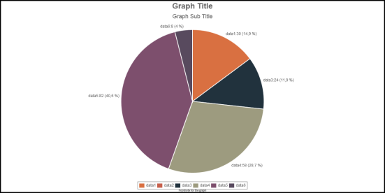
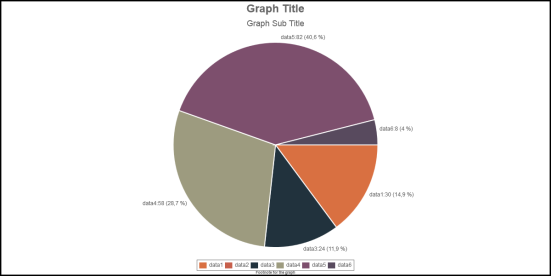
Description : by default, the border of the first data of pie/doughnut/polarArea/radar is displayed at the vertical position (angle of 90 degres). With option startAngle, you can decide the starting angle for the border of the first data. In this samples, on the right the startAngle is 90 degres; on the left, the startAngle is 0 degres.
Chart types : Pie, DoughNut, polarArea
Values : any real value
Default value : 90
Sample : startAngle : 0
See also :
Description : by default, the shape of the Pie/Doughnut/PolarArea charts is a full circle; With option totalAmplitude, you can reduce the circle to an arc. For instance, if totalAmplitude is set to 180, the shape will be reduced to a half Pie/Doughnut/PolarArea. Combined with option startAngle, you can set the orientation of the shape.
Chart types : Pie, DoughNut, polarArea, radar
Values : any real value
Default value : 360
Sample : totalAmplitude : 180
See also : startAngle; Samples\half_pie.html.
Previous Chapter Previous Page Next Page Next Chapter Top of Page

